Perhatian : para pengunjung di Larang Pencet / klik judul iklan yg bertentangan dengan SYARIAH ISLAM, harap maklum karena pemilik website tidak bisa mengontrol penuh tampilan iklan. .. terimakasih dan anda berkunjung di blogger tentang modif motor efek chroom, krom, crom, semoga kita semua selalu diberi keselamatan dan kesehatan oleh Alloh SWT. amin ya robbal alamin.
Tampilkan postingan dengan label Blogger. Tampilkan semua postingan

Minggu, 02 Juni 2013

Cara membuat Headlines News Sederhana

Cara membuat Headlines News Sederhana | Trik Mudah Bikin Breaking News atau Artikel Terbaru di Munculkan satu persatu. Salah satu aksesories blog yang sangat penting adalah Headlines News, karena berfungsi menampilkan beberapa postingan terbaru blog anda sehingga pengunjung akan dengan mudah melihat apa artikel terbaru yang ada dalam blog anda.
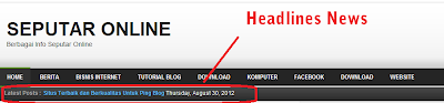
Headlines News sama dengan Recent Post hanya saja tampilannya lebih simpel yang hanya menampilkan title atau judul dari beberapa postingan terbaru. Yang paling populer saat ini adalah menempatkan Headlines News di bagian bawah header, ada juga yang menempatkan di bagian atas dan di bawah menu (header). Namun sciptnya sama saja, untuk menempatkan di posisi mana itu terserah anda, namun pada kali ini saya akan membahas dengan cara menampilkan Headline News di bawah Header seperti yang ada pada gambar berikut.
Cara membuat Headlines News Sederhana


Untuk membuatnya tidak terlalu sulih, dengan sedikit keberanin untuk mengotak atik script template blog anda kemudian menambahkan sedikit script di beberapa tag elemen Insya Allah langsung berhasil. Untuk lebih jelasnya berikut langkah langkahnya.

Pertama masuk ke akun blogger anda lalu KLIK Template => Edit HTML => Lanjutkan Kemudian CENTANG pada Expand Template Widget lalu cari kode ]]></b:skin> untuk memper cepat atau memudahkan pencarian CTRL+Fkemudian copy paste kode ]]></b:skin> pada kolom yang muncul. Setelah menemukan kode di atas copy kode di bawah ini kemudian pastekan pas sebelum atau di atas kode ]]></b:skin> yang telah di cari tadi

.headline-wrapper{background:url(https://lh3.googleusercontent.com/-leV22rchdzc/UAP58mLNrFI/AAAAAAAADb4/sRUlcvkSIsA/s38/headline-bg.png) repeat-x;width:950px;height:30px;margin:0 auto;padding:0 auto}
.headline{width:950px;line-height:1.4em;text-align:left;font-family:Arial;font-size:12px;color:#4f4f4f;overflow:hidden;clear:both;margin:0 auto;padding:0 auto;text-shadow: 1px 1px 1px #000}
.headline a:hover{color:#eace12;text-decoration:none}

Ganti yang berwarna biru dengan  url gambar sesuai dengan background headlines news yang anda inginkan, kemudian yang berwarna pink boleh diganti dengan angka sesuai dengan lebar yang di inginkan.


Kemudian cari kode </head> untuk memudahkan gunakan kembali CTRL+F. Setelah ketemu Copy kode di bawah ini lalu pastekan sebelum atau di atas kode </head>


<script src='https://www.google.com/jsapi?key=ABQIAAAAlQIoliUVPjZwD8UDgw_U3RTUhB4JyH-ajz-fA9t4yePPPdGAfRTC_mtuh6Iq1MLEipD0I2rCi30Png' type='text/javascript'/>
<script src='http://exlorer-amran91.googlecode.com/files/HDN.js' type='text/javascript'/>
<style type='text/css'>
.titlefield{ /*CSS for RSS title link in general*/
text-decoration: none;}
.labelfield{ /*CSS for label field in general*/
color:#666;font-size: 100%;}
.datefield{ /*CSS for date field in general*/
color:#fff;font:normal 12px Arial;}
#example1{ /*Demo 1 main container*/
width: 900px;
height: 12px;
border: 0px solid #aaa;
padding: 0px;
font:bold 12px Arial;
text-transform:none;
text-align:left;
background-color:transparent;}
code{ /*CSS for insructions*/
color: #fff;}
#example1 a:link, #example1 a:visited {color:#60BAFA;text-decoration:none;}
#example1 a:hover {color:#fff;text-decoration:none;}
</style>

 Kemudian cari kode berikut ini <b:section class='header' id='header' . hingga kurang lebih seperti berikut ini 

<b:section class='header' id='header' maxwidgets='1' showaddelement='no'>
<b:widget id='Header1' locked='true' title='Your Title (Header)' type='Header'>
<b:includable id='main'>

Setelah ketemu kode seperti di atas copy kode di bawah ini kemudian pastekan pas dibawahnya berikut kodenya

<div class='headline-wrapper'>
<div class='headline'>
<div style='float:left;padding:5px 5px 5px 10px;font:bold 12px Arial;color:#aeaeae;text-transform:none;'>
Headlines News :
</div>
<div style='float:left;width:800px;padding:5px 0; position:relative; overflow:hidden;'>
<script type='text/javascript'>
var cssfeed=new gfeedrssticker(&quot;example1&quot;, &quot;example1class&quot;, 3000, &quot;_new&quot;)
cssfeed.addFeed(&quot;Latest Movies&quot;, &quot;http://GANTI DENGAN URL BLOG ANDA/feeds/posts/default&quot;) //Specify &quot;label&quot; plus URL to RSS feed
cssfeed.displayoptions(&quot;date&quot;) //show the specified additional fields
cssfeed.setentrycontainer(&quot;div&quot;) //Wrap each entry with a DIV tag
cssfeed.filterfeed(10, &quot;date&quot;) //Show 10 entries, sort by date
cssfeed.entries_per_page(1)
cssfeed.init()
</script>
</div>
</div><div style='clear:both;'/>
</div>

Ganti tulisan yang berwarna biru dengan url Blog ANDA misanya url blog saya : hatiku-nuraniku.blogspot.com lalu klik Simpan Template dan lihat hasilnya.

Semoga bermanfaat, dan anda juga bisa menemukan cara ini di sini. Ok demikianlah postingan kali ini, sampai jumpa lagi di lain kesempatan.
 
Saya fafan, Artikel ini tentang Cara membuat Headlines News Sederhana
Baca selengkapnya..

Senin, 27 Mei 2013

Contoh Gambar macam Box Shadow

Contoh Gambar macam Box Shadow | Bentuk Variasi Ragam Box Shadow | Aneka Ragam Penggunaan Box Shadow.
Below are some examples of an orange box with a blue border being given a drop shadow.
border:5px solid blue;
background-color:orange;
width: 144px;
height: 144px;
border-radius: 20px;
border-radius: 0;
box-shadow:
  rgba(0,0,0,0.4)
  10px 10px;
A round-cornered box with a light gray shadow the same shape                 as the border box offset 10px to the right and 10px down                 from directly underneath the box. A square-cornered box with a light gray shadow the same shape                 as the border box offset 10px to the right and 10px down                 from directly underneath the box.
box-shadow:
  rgba(0,0,0,0.4)
  10px 10px
  inset
A round-cornered box with a light gray shadow the inverse shape                 of the padding box filling 10px in from the top and left edges                 (just inside the border). A square-cornered box with a light gray shadow the inverse shape                 of the padding box filling 10px in from the top and left edges                 (just inside the border).
box-shadow:
  rgba(0,0,0,0.4)
  10px 10px 0
  10px /* spread */
A round-cornered box with a light gray shadow the same shape                 as the box but 20px taller and wider and offset so that the                 top and left edges of the shadow are directly underneath the                 top and left edges of the box. A square-cornered box with a light gray shadow the same shape                 as the box but 20px taller and wider and offset so that the                 top and left edges of the shadow are directly underneath the                 top and left edges of the box.
box-shadow:
  rgba(0,0,0,0.4)
  10px 10px 0
  10px /* spread */
  inset
A round-cornered box with a light gray shadow the inverse shape                 of the box but 20px narrower and shorter filling 20px in from                 the top and left edges (just inside the border). A round-cornered box with a light gray shadow the inverse shape                 of the box but 20px narrower and shorter filling 20px in from                 the top and left edges (just inside the border).


Contoh yang lain :


For example, the borders A of the figure below might be the result of
box-sizing: border-box;
width: 6em;
height: 2.5em;
border-radius: 0.5em 2em 0.5em 2em
The height (2.5em) is enough for the specified radii (0.5em plus 2.0em). However, if the height is only 2em,
box-sizing: border-box;
width: 6em;
height: 2em;
border-radius: 0.5em 2em 0.5em 2em
all corners need to be reduced by a factor 0.8 to make them fit. The used border radii thus are 0.4em (instead of 0.5em) and 1.6em (instead of 2em). See borders B in the figure.
[image: rectangle with two tiny   rounded corners and two very large ones, on opposite corners]
These rounded corner might be the result of ‘width: 6em; height: 2.5em; border-radius: 0.5em 2em 0.5em 2em’ for A; and ditto but with ‘height: 2em’ for B. 

The curved corner is an arc from the top left corner sweeping                across the top right corner to the bottom right corner, describing                a quarter-ellipse; but since the opposite sides have a border                thickness the padding edge curve starts inward from the outer arc's                endpoints.

Contoh gambar yang lain :

p { width: 70px; height: 70px; border: solid 30px;
    border-color: orange orange silver silver;
    border-top-right-radius: 100%; }


 Contoh soal yang lain :
p { border: solid red }
p {
  border-top: solid red;
  border-right: solid red;
  border-bottom: solid red;
  border-left: solid red;
  border-image: none;
}
Since, to some extent, the properties have overlapping functionality, the order in which the rules are specified is important.
Consider this example:
blockquote {
  border-color: red;
  border-left: double;
  color: black
}


Contoh yang lain :
 Border-style’ is a shorthand for the other four. Its four values set the top, right, bottom and left border respectively. A missing left is the same as right, a missing bottom is the same as top, and a missing right is also the same as top.
Where
<border-style> = none | hidden | dotted | dashed | solid | double | groove | ridge | inset | outset
Values have the following meanings:
‘none’
No border. Color and width are ignored (i.e., the border has width 0, unless the border is an image, see ‘background-image’
‘hidden’
Same as ‘none’, but has different behavior in the border conflict resolution rules for border-collapsed tables [CSS21].
‘dotted’
A series of round dots.
‘dashed’
A series of square-ended dashes.
‘solid’
A single line segment.
‘double’
Two parallel solid lines with some space between them. (The thickness of the lines is not specified, but the sum of the lines and the space must equal ‘border-width’.)
‘groove’
Looks as if it were carved in the canvas. (This is typically achieved by creating a “shadow” from two colors that are slightly lighter and darker than the ‘border-color’.)
‘ridge’
Looks as if it were coming out of the canvas.
‘inset’
Looks as if the content on the inside of the border is sunken into the canvas. Treated as ‘ridge’ in the collapsing border model. [CSS21]
‘outset’
Looks as if the content on the inside of the border is coming out of the canvas. collapsing border model. [CSS21]
Borders are drawn in front of the element's background, but behind the element's content (in case it overlaps).
Examples of border styles


Mengenal tentang Variasi Perintah Background :
The following declaration with multiple, comma-separated values
background: url(a.png) top left no-repeat,
            url(b.png) center / 100% 100% no-repeat,
            url(c.png) white;
is equivalent to
background-image:      url(a.png),  url(b.png),          url(c.png);
background-position:   top left,    center,              top left;
background-repeat:     no-repeat,   no-repeat no-repeat, repeat;
background-clip:       border-box,  border-box,          border-box;
background-origin:     padding-box, padding-box,         padding-box;
background-size:       auto auto,   100% 100%,           auto auto;
background-attachment: scroll,      scroll,              scroll;
background-color:      white;

source artikel by. w3.org/TR/css3-background/
Artikel saya fafan Postingan tentang Contoh Gambar macam Box Shadow
Baca selengkapnya..

Belajar Box Shadow

Belajar Box Shadow | Mengenal Variasi Box shadow | Cara Membuat Border bayangan.
The CSS3 border-radius property allows web developers to easily utilise rounder corners in their design elements, without the need for corner images or the use of multiple div tags, and is perhaps one of the most talked about aspects of CSS3.
Since first being announced in 2005 the boder-radius property has come to enjoy widespread browser support (although with some discrepancies) and, with relative ease of use, web developers have been quick to make the most of this emerging technology.
Here’s a basic example:
This box should have a rounded corners for Firefox, Safari/Chrome, Opera and IE9.
The code for this example is, in theory, quite simple:
#example1 {
border-radius: 15px;
}
However, for the moment, you’ll also need to use the -moz- prefix to support Firefox (see the browser support section of this article for further details):
#example1 {
-moz-border-radius: 15px;
border-radius: 15px;
}

How it Works

Rounder corners can be created independently using the four individual border-*-radius properties (border-bottom-left-radius, border-top-left-radius, etc.) or for all four corners simultaneously using the border-radius shorthand property.
We will firstly deal with the syntax for the individual border-*-radius properties before looking at how the border-radius shorthand property works.

border-bottom-left-radius, border-bottom-right-radius, border-top-left-radius, border-top-right-radius

The border-*-radius properties can each accept either one or two values, expressed as a length or a percentage (percentages refer to the corresponding dimensions of the border box).
The Syntax:
border-*-*-radius: [ <length> | <%> ] [ <length> | <%> ]?
Examples:
border-top-left-radius: 10px 5px;
border-bottom-right-radius: 10% 5%;
border-top-right-radius: 10px;
Where two values are supplied these are used to define, in order, the horizontal and vertical radii of a quarter ellipse, which in turn determines the curvature of the corner of the outer border edge.
Where only one value is supplied, this is used to define both the horizontal and vertical radii equally.
The following diagram gives a few examples of how corners might appear given differing radii:
border-radius-diagram-1
If either value is zero, the corner will be square, not round.

border-radius

The border-radius shorthand property can be used to define all four corners simultaneously. The property accepts either one or two sets of values, each consisting of one to four lengths or percentages.
The Syntax:
[ <length> | <percentage> ]{1,4} [ / [ <length> | <percentage> ]{1,4} ]?
Examples:
border-radius: 5px 10px 5px 10px / 10px 5px 10px 5px;
border-radius: 5px;
border-radius: 5px 10px / 10px;
The first set of (1-4) values define the horizontal radii for all four corners. An optional second set of values, preceded by a ‘/’, define the vertical radii for all four corners. If only one set of values are supplied, these are used to determine both the vertical and horizontal equally.
For each set of values the following applies:
If all four values are supplied, these represent the top-left, top-right, bottom-right and bottom-left radii respectively. If bottom-left is omitted it is the same as top-right, if bottom-right is omitted it is the same as top-left, and if only one value is supplied it is used to set all four radii equally.

Browser Support

At present Opera (version 10.5 onward), Safari (version 5 onward) and Chrome (version 5 onward) all support the individual border-*-radius properties and the border-radius shorthand property as natively defined in the current W3C Specification (although there are still outstanding bugs on issues such as border style transitions, using percentages for lengths, etc.).
Mozilla Firefox (version 1.0 onward) supports border-radius with the -moz- prefix, although there are some discrepancies between the Mozilla implementation and the current W3C specification (see below).
Update:Recent Firefox nightly versions support border-radius without the -moz- prefix.
Safari and Chrome (and other webkit based browsers) have supported border-radius with the -webkit- prefix since version 3 (no longer needed from version 5 onward), although again with some discrepancies from the current specification (see this article for further details of how older versions of Webkit handle border-radius).
Even Microsoft have promised, and demonstrated in their recent preview release, support for border-radius from Internet Explorer 9 onward (without prefix).

The -moz- prefix

Mozilla’s Firefox browser has supported the border-radius property, with the -moz- prefix, since version 1.0. However, it is only since version 3.5 that the browser has allowed elliptical corners, i.e. accepting two values per corner to determine the horizontal and verical radii independently. Prior to version 3.5, the browser only accepted one value per corner, resulting in corners with equal horizontal and vertical radii.
The syntax, from Firefox 3.5 onwards, for the main part follows the current W3C specification, as described throughout this article, prefixed by -moz-. The only major difference is in the naming of the individual border-*-radius properties, with the -moz- prefixed properties following a slightly different naming convention as follows:
W3C Specification Mozilla Implementation
border-radius -moz-border-radius
border-top-left-radius -moz-border-radius-topleft
border-top-right-radius -moz-border-radius-topright
border-bottom-right-radius -moz-border-radius-bottomright
border-bottom-left-radius -moz-border-radius-bottomleft
The Mozilla implementation also behaves slightly differently from the specification when percentages are supplied. You can read more on the Mozilla Developer Center here.

Cross Browser Examples

Here’s a few basic examples that should work in current versions of Firefox, Safari/Chrome, Opera and even IE9:
A
B
C
D
E
F

#Example_A {
height: 65px;
width:160px;
-moz-border-radius-bottomright: 50px;
border-bottom-right-radius: 50px;
} #Example_B {
height: 65px;
width:160px;
-moz-border-radius-bottomright: 50px 25px;
border-bottom-right-radius: 50px 25px;
}
#Example_C {
height: 65px;
width:160px;
-moz-border-radius-bottomright: 25px 50px;
border-bottom-right-radius: 25px 50px;
}
#Example_D {
height: 5em;
width: 12em;
-moz-border-radius: 1em 4em 1em 4em;
border-radius: 1em 4em 1em 4em;
}
#Example_E {
height: 65px;
width:160px;
-moz-border-radius: 25px 10px / 10px 25px;
border-radius: 25px 10px / 10px 25px;
}
#Example_F {
height: 70px;
width: 70px;
-moz-border-radius: 35px;
border-radius: 35px;
}

Additional Notes & Further Reading

The W3C Backgrounds and Borders Specification goes into further detail on how the corner is shaped (especially in circumstances where two adjoining border have different widths), the effect of border-radius on background images, color and style transitions, what happens when curves overlap and the effect of border-radius on tables.
This is best explained in the following sections of the specification:
source info from css3.info/preview/rounded-border/

Artikel saya fafan postingan tentang Belajar Box Shadow
Baca selengkapnya..

Belajar Variasi Shadows untuk Blog

Belajar Variasi Shadows untuk Blog | Cara Membuat Bayangan pada Blogger.
The box-shadow property allows designers to easily implement multiple drop shadows (outer or inner) on box elements, specifying values for color, size, blur and offset.
Browser support is growing of late with Mozilla (Firefox), Webkit (Safari/Chrome/Konqueror), Opera and the IE9 Platform Preview all offering a decent implementation of the spec, although Mozilla and Webkit still require their respective -moz- and -webkit- prefixes (note Mozilla Firefox 4.0+ no longer requires the -moz- prefix).
Here’s a basic example:
Firefox, Safari/Chrome, Opera and IE9 users should see a grey fading shadow under this box.
In theory, the code for this is straightforward:
#example1 {
box-shadow: 10px 10px 5px #888;
}
But for the moment, as with many other ‘experimental’ CSS3 properties, you’ll need to use the following prefixes to support Mozilla and Webkit:
#example1 {
-moz-box-shadow: 10px 10px 5px #888;
-webkit-box-shadow: 10px 10px 5px #888;
box-shadow: 10px 10px 5px #888;
}

How it Works

The box-shadow property can accept a comma-separated list of shadows, each defined by 2-4 length values (specifying in order the horizontal offset, vertical offset, optional blur distance and optional spread distance of the shadow), an optional color value and an optional ‘inset‘ keyword (to create an inner shadow, rather than the default outer shadow).

The Syntax:
box-shadow: none | <shadow> [ , <shadow> ]* <shadow> = inset? && [ <length>{2,4} && <color>? ]

Examples:
box-shadow: 10px 10px;
box-shadow: 10px 10px 5px #888;
box-shadow: inset 2px 2px 2px 2px black;
box-shadow: 10px 10px #888, -10px -10px #f4f4f4, 0px 0px 5px 5px #cc6600;

Let’s first look at how to create a basic outer shadow, before going on to look at the inset keyword, layering multiple shadows and how to spice up your shadows with RGBa colors(?).

Creating a basic drop shadow

By default, shadows are drawn on the outside of elements. According to the specification;
An outer box-shadow casts a shadow as if the border-box of the element were opaque. The shadow is drawn outside the border edge only: it is clipped inside the border-box of the element.
The first step is to define the shape of the shadow by specifying 2-4 length values.
The first value defines the horizontal offset of the shadow, with a positive value offseting the shadow to the right of the element, and a negative value to the left.
The second value defines the vertifical offset of the shadow, with a positive value offsetting the shadow from the bottom of the element, and a negative value from the top.
If supplied, an optional third value defines the blur distance of the shadow. Only positive values are allowed, and the larger the value, the more the shadow’s edge is blurred. The specification does not include an exact algorithm for how the blur distance should be calculated, however it does elaborate as follows:
…for a long, straight shadow edge, this should create a color transition the length of the blur distance that is perpendicular to and centered on the shadow’s edge, and that ranges from the full shadow color at the radius endpoint inside the shadow to fully transparent at the endpoint outside it.
An optional fourth value can be supplied to define the spread distance of the shadow. A positive value will cause the shadow shape to expand in all directions, while a negative value will cause the shadow shape to contract. The specification goes into much greater detail on how the shadow shape is calculated as follows:
If a spread distance is defined, the shadow is expanded outward or contracted inward by an operation equivalent to applying twice the absolute value of the spread value to a blur operation as defined below and thresholding the result such that for a positive spread distance all non-transparent pixels are given the full shadow color and for a negative spread distance all non-opaque pixels are made transparent. The UA may approximate this operation by taking an outward outset of the specified amount normal to the original shadow perimeter. Alternatively the UA may approximate the transformed shadow perimeter shape by outsetting (insetting, for inner shadows) the shadow’s straight edges by the spread distance and increasing (decreasing, for inner shadows) and flooring at zero the corner radii by the same amount. (The UA may even combine these methods, using one method for outer shadows and another for inner ones.) For corners with a zero border-radius, however, the corner must remain sharp—the operation is equivalent to scaling the shadow shape. In any case, the effective width and height of the shadow shape is floored at zero. (A zero-sized shadow shape would cause an outer shadow to disappear, and an inner shadow to cover the entire padding-box.)
The diagram below (taken from the W3C Backgrounds and Borders Candidate Recommendation) offers a good example of the effects of spread and blur on the shadow:
Spread Radius and Blur Radius diagram
An optional color value can also be supplied, directly after the 2-4 length values, to define the shadow’s color. If not supplied, a UA-chosen default should be applied, however, whilst in Firefox/Opera/IE9 the default color is black, in Safari/Chrome (webkit) no shadow is visible unless a color is specified.
Here are a few examples of shadows with differing offsets, spread and blur.

Examples:
A
B
C
D
E
F

Example A shows a shadow offset to the left and top by 5px:
#Example_A {
-moz-box-shadow: -5px -5px #888;
-webkit-box-shadow: -5px -5px #888;
box-shadow: -5px -5px #888;
}

Example B shows the same shadow with a blur distance of 5px:
#Example_B {
-moz-box-shadow: -5px -5px 5px #888;
-webkit-box-shadow: -5px -5px 5px #888;
box-shadow: -5px -5px 5px #888;
}

Example C shows the same shadow with a spread distance of 5px:
#Example_C {
-moz-box-shadow: -5px -5px 0 5px #888;
-webkit-box-shadow: -5px -5px 0 5px#888;
box-shadow: -5px -5px 0 5px #888;
}

Example D shows the same shadow with both a blur distance of 5px and a spread distance of 5px:
#Example_D {
-moz-box-shadow: -5px -5px 5px 5px #888;
-webkit-box-shadow: -5px -5px 5px 5px#888;
box-shadow: -5px -5px 5px 5px #888;
}

Example E shows a shadow with no offset and a blur distance of 5px:
#Example_E {
-moz-box-shadow: 0 0 5px #888;
-webkit-box-shadow: 0 0 5px#888;
box-shadow: 0 0 5px #888;
}

Example F shows a shadow with no offset and both a blur distance of 5px and a spread distance of 5px:
#Example_F {
-moz-box-shadow: 0 0 5px 5px #888;
-webkit-box-shadow: 0 0 5px 5px#888;
box-shadow: 0 0 5px 5px #888;
}


Creating an inner shadow with the ‘inset’ keyword

An optional ‘inset‘ keyword can be supplied, preceding the length and color values. If present, this keyword causes the shadow to be drawn inside the element. According to the specification:
An inner box-shadow casts a shadow as if everything outside the padding edge were opaque. The inner shadow is drawn inside the padding edge only: it is clipped outside the padding box of the element.
Here are the same examples as above, this time with the ‘inset‘ keyword present.

Examples:
G
H
I
J
K
L

Example G shows an inner shadow offset to the left and top by 5px:
#Example_G {
-moz-box-shadow: inset -5px -5px #888;
-webkit-box-shadow: inset -5px -5px #888;
box-shadow: inset -5px -5px #888;
}

Example H shows the same inner shadow with a blur distance of 5px:
#Example_H {
-moz-box-shadow: inset -5px -5px 5px #888;
-webkit-box-shadow: inset -5px -5px 5px #888;
box-shadow: inset -5px -5px 5px #888;
}

Example I shows the same inner shadow with a spread distance of 5px:
#Example_I {
-moz-box-shadow: inset -5px -5px 0 5px #888;
-webkit-box-shadow: inset -5px -5px 0 5px#888;
box-shadow: inset -5px -5px 0 5px #888;
}

Example J shows the same inner shadow with both a blur distance of 5px and a spread distance of 5px:
#Example_J {
-moz-box-shadow: inset -5px -5px 5px 5px #888;
-webkit-box-shadow: inset -5px -5px 5px 5px#888;
box-shadow: inset -5px -5px 5px 5px #888;
}

Example K shows an inner shadow with no offset and a blur distance of 5px:
#Example_K {
-moz-box-shadow: inset 0 0 5px #888;
-webkit-box-shadow: inset 0 0 5px#888;
box-shadow: inner 0 0 5px #888;
}

Example L shows an inner shadow with no offset and both a blur distance of 5px and a spread distance of 5px:
#Example_L {
-moz-box-shadow: inset 0 0 5px 5px #888;
-webkit-box-shadow: inset 0 0 5px 5px#888;
box-shadow: inset 0 0 5px 5px #888;
}


Layering multiple shadows

The box-shadow property allows elements to have multiple shadows, specified by a comma seperated list. When more than one shadow is specified, the shadows are layered front to back, as in the following example.

Example:
M
Example M shows five shadows specified in the following order; firstly a black shadow with a spread distance of px and a blur distance of px, secondly a lime shadow offset to the top right, thirdly a red shadow offset to the bottom right with a blur distance applied, fourthly a yellow shadow offset to the bottom left, and lastly a blue shadow offset to the top left with a blur distance applied:
#Example_M {
-moz-box-shadow: 0 0 10px 5px black, 40px -30px lime, 40px 30px 50px red, -40px 30px yellow, -40px -30px 50px blue;
-webkit-box-shadow: 0 0 10px 5px black, 40px -30px lime, 40px 30px 50px red, -40px 30px yellow, -40px -30px 50px blue;
box-shadow: 0 0 10px 5px black, 40px -30px lime, 40px 30px 50px red, -40px 30px yellow, -40px -30px 50px blue;
}


Spicing up shadows with RGBa color & border-radius

The box-shadow property can be further enhanced using CSS3 RGBa colors to create shadows with differing levels of opacity, as demonstrated by the examples below.

Examples:

N
O
P


Example N shows a black shadow, specified using standard RGB color, offset to the right and bottom by 5px:
#Example_N {
-moz-box-shadow: 5px 5px rgb(0,0,0);
-webkit-box-shadow: 5px 5px rgb(0,0,0);
box-shadow: 5px 5px rgb(0,0,0);
}

Example O shows the same shadow, this time with the color black specified using RGBa color with an opacity of 70%:
#Example_O {
-moz-box-shadow: 5px 5px rgba(0,0,0,0.7);
-webkit-box-shadow: 5px 5px rgba(0,0,0,0.7);
box-shadow: 5px 5px rgba(0,0,0,0.7);
}

Example P shows the same shadow, this time with the color black specified using RGBa color with an opacity of 50%:
#Example_P {
-moz-box-shadow: 5px 5px rgba(0,0,0,0.5);
-webkit-box-shadow: 5px 5px rgba(0,0,0,0.5);
box-shadow: 5px 5px rgba(0,0,0,0.5);
}

The box-shadow property can also be applied to elements with rounded corners, created using the border-radius property, in which case the shadow will follow the curve specified by the border-radius property (note: although IE9 seems to struggle with this).

Examples:
Q
R

Example Q shows a shadow offset to the bottom and right by 5px, with a border-radius of 5px applied to each corner:
#Example_Q {
-moz-border-radius: 5px;
border-radius: 5px;
-moz-box-shadow: 5px 5px black;
-webkit-box-shadow: 5px 5px black;
box-shadow: 5px 5px black;
}

Example R shows the same shadow with a blur distance of 5px:
#Example_R {
-moz-border-radius: 5px;
border-radius: 5px;
-moz-box-shadow: 5px 5px 5px black;
-webkit-box-shadow: 5px 5px 5px black;
box-shadow: 5px 5px 5px black;
}


Browser Support

The box-shadow property has not caught on as quickly as some of its peers (such as the border-radius property) and the property was removed from the CSS3 Backgrounds and Borders specification when it reached Candidate Recommendation earlier this year, pending further development, however the property has been reintroduced in the latest version of the specification and browser support has been growing steadily of late.
The table below provides an overview of current browser support.
Browser Basic support Multiple shadows inset keyword Spread radius
Internet Explorer 9.0 box-shadow 9.0 9.0 9.0
Firefox
(Gecko)
4.0
(2.0)
box-shadow 4.0
(2.0)
4.0
(2.0)
4.0
(2.0)
3.5
(1.9.1)
-moz-box-shadow 3.5
(1.9.1)
3.5
(1.9.1)
3.5
(1.9.1)
Opera 10.5 box-shadow 10.5 10.5 10.5
Safari/Chrome
(WebKit)
3.0/1.0
(522)
-webkit-box-shadow 4.0/1.0
(528)
5.0/4.0
(533)
5.0/4.0
(533)
Browser support data courtesy of Mozilla Developer Center.

Additional Notes and Further Reading

The CSS3 Backgrounds and Borders specification makes the following additional notes with regard to the effect of box-shadow on layout and how it interacts with other elements:
  • Shadows do not influence layout and may overlap other boxes or their shadows. In terms of stacking contexts and the painting order, the outer shadows of an element are drawn immediately below the background of that element, and the inner shadows of an element are drawn immediately above the background of that element (below the borders and border image, if any).
  • If an element has multiple boxes, all of them get drop shadows, but shadows are only drawn where borders would also be drawn; see ‘box-decoration-break’.
  • Shadows do not trigger scrolling or increase the size of the scrollable area.
  • The ‘border-image’ does not affect the shape of the box-shadow.
  • The ‘box-shadow’ property applies to the ‘::first-letter’ pseudo-element, but not the ‘::first-line’ pseudo-element. Outer shadows have no effect on internal table elements in the collapsing border model. If a shadow is defined for single border edge in the collapsing border model that has multiple border thicknesses (e.g. an outer shadow on a table where one row has thicker borders than the others, or an inner shadow on a rowspanning table cell that adjoins cells with different border thicknesses), the exact position and rendering of its shadows are undefined.
posting source from css3.info/preview/box-shadow/

Artikel saya fafan postingan tentang Belajar Variasi Shadows untuk Blog
Baca selengkapnya..

Minggu, 19 Mei 2013

Menu Drop Down di Gabung Kotak Search

Menu Drop Down di Gabung Kotak Search | Cara Membuat Menu Drop Down yang Keren dengan Menu Search | Cara membuat Menu Horizontal yang keren sobat tidak salah tempat karena sekarang saya akan share sedikit ilmu kepada sobat blogger, menu ini memang bukan buatan saya, tapi sudah saya modifikasi sedikit semoga sobat sobat senang dengan menu ini, sebelum ke cara pembuatan nya ada baik nya kalau sobat-sobat melihat tampilan hasil nya lihat gambar di bawah ini sebagai tampilan hasil nya

Segera cara pembuatan dengan langkahnya sbb :
  • Pertama tama sopasti kita harus login ke blog
  • setelah login masuk ke menu Template setelah itu Centang Expand Template Widget dan cari Code
  • setelah dapat copy code di bawah ini tepat di atas code yang tadi kita cari ]]></b:skin>
    /* Menu Horizontal Dropdown
    ----------------------------------------------- */

    #menu
    {
    width: 100%;
    margin: 0;
    padding: 10px 0 0 0;
    list-style: none;
    background: #111;
    background: -moz-linear-gradient(#444, #111);
    background: -webkit-gradient(linear,left bottom,left top,color-stop(0, #111),color-stop(1, #444));
    background: -webkit-linear-gradient(#444, #111);
    background: -o-linear-gradient(#444, #111);


    background: -ms-linear-gradient(#444, #111);
    background: linear-gradient(#444, #111);
    -moz-border-radius: 50px;
    border-radius: 50px;
    -moz-box-shadow: 0 2px 1px #9c9c9c;
    -webkit-box-shadow: 0 2px 1px #9c9c9c;
    box-shadow: 0 2px 1px #9c9c9c;
    }
    #menu li
    {
    float: left;
    padding: 0 0 10px 0;
    position: relative;
    line-height: 0;
    }
    #menu a
    {
    float: left;
    height: 25px;
    padding: 0 25px;
    color: #999;
    text-transform: uppercase;
    font: bold 12px/25px Arial, Helvetica;
    text-decoration: none;
    text-shadow: 0 1px 0 #000;
    }
    #menu li:hover > a
    {

    color:#fff; text-decoration:line-through;
    }
    *html #menu li a:hover /* IE6 */
    {
    color:#fff; text-decoration:line-through;
    }
    #menu li:hover > ul
    {
    display: block;
    }
    /* Sub-menu */
    #menu ul
    {
    list-style: none;
    margin: 0;
    padding: 0;
    display: none;
    position: absolute;
    top: 35px;
    left: 0;
    z-index: 99999;
    background: #444;
    background: -moz-linear-gradient(#444, #111);
    background: -webkit-gradient(linear,left bottom,left top,color-stop(0, #111),color-stop(1, #444));
    background: -webkit-linear-gradient(#444, #111);
    background: -o-linear-gradient(#444, #111);
    background: -ms-linear-gradient(#444, #111);
    background: linear-gradient(#444, #111);
    -moz-box-shadow: 0 0 2px rgba(255,255,255,.5);
    -webkit-box-shadow: 0 0 2px rgba(255,255,255,.5);
    box-shadow: 0 0 2px rgba(255,255,255,.5);
    -moz-border-radius: 5px;
    border-radius: 5px;
    }
    #menu ul ul
    {
    top: 0;
    left: 150px;
    }
    #menu ul li
    {
    float: none;
    margin: 0;
    padding: 0;
    display: block;
    -moz-box-shadow: 0 1px 0 #111111, 0 2px 0 #777777;
    -webkit-box-shadow: 0 1px 0 #111111, 0 2px 0 #777777;
    box-shadow: 0 1px 0 #111111, 0 2px 0 #777777;
    }
    #menu ul li:last-child
    {
    -moz-box-shadow: none;
    -webkit-box-shadow: none;
    box-shadow: none;
    }
    #menu ul a
    {
    padding: 10px;
    height: 10px;
    width: 130px;
    height: auto;
    line-height: 1;
    display: block;
    white-space: nowrap;
    float: none;
    text-transform: none;
    }
    *html #menu ul a /* IE6 */
    {
    height: 10px;
    }
    *:first-child+html #menu ul a /* IE7 */
    {
    height: 10px;
    }
    #menu ul a:hover
    {
    background: #0186ba;
    background: -moz-linear-gradient(#04acec, #0186ba);
    background: -webkit-gradient(linear, left top, left bottom, from(#04acec), to(#0186ba));
    background: -webkit-linear-gradient(#04acec, #0186ba);
    background: -o-linear-gradient(#04acec, #0186ba);
    background: -ms-linear-gradient(#04acec, #0186ba);
    background: linear-gradient(#04acec, #0186ba);
    }
    #menu ul li:first-child > a
    {
    -moz-border-radius: 5px 5px 0 0;
    border-radius: 5px 5px 0 0;
    }
    #menu ul li:first-child > a:after
    {
    content: '';
    position: absolute;
    left: 30px;
    top: -8px;
    width: 0;
    height: 0;
    border-left: 5px solid transparent;
    border-right: 5px solid transparent;
    border-bottom: 8px solid #444;
    }
    #menu ul ul li:first-child a:after
    {
    left: -8px;
    top: 12px;
    width: 0;
    height: 0;
    border-left: 0;
    border-bottom: 5px solid transparent;
    border-top: 5px solid transparent;
    border-right: 8px solid #444;
    }
    #menu ul li:first-child a:hover:after
    {
    border-bottom-color: #04acec;
    }
    #menu ul ul li:first-child a:hover:after
    {
    border-right-color: #04acec;
    border-bottom-color: transparent;
    }

    #menu ul li:last-child > a
    {
    -moz-border-radius: 0 0 5px 5px;
    border-radius: 0 0 5px 5px;
    }
    /* Clear floated elements */
    #menu:after
    {
    visibility: hidden;
    display: block;
    font-size: 0;
    content: " ";
    clear: both;
    height: 0;
    }
    * html #menu { zoom: 1; } /* IE6 */
    *:first-child+html #menu { zoom: 1; } /* IE7 */

    #search{ width:220px; float:right; margin:0px 5px 0px 5px; align:center;
    }
    #search input[type="text"] {height:24px; line-height:29px; background: url(http://3.bp.blogspot.com/-qcqxuwepuw8/T7Ts0Iso9VI/AAAAAAAAAkg/oGskZqNwrZY/s1600/search_icon.gif) no-repeat 8px 1px #fff; border: 0 none; font: bold 12px; color: #333; width: 172px; padding: 0 15px 0 32px; -webkit-border-radius: 12px; -moz-border-radius: 12px; border-radius: 12px; border:1px solid #eee; -webkit-box-shadow: 0px 1px 0px rgba(255, 255, 255, 0.3) , inset 0px 1px 3px rgba(0, 0, 0, 0.2); -moz-box-shadow: 0px 1px 0px rgba(255, 255, 255, 0.3) , inset 0px 1px 3px rgba(0, 0, 0, 0.2); box-shadow: 0px 1px 0px rgba(255, 255, 255, 0.3) , inset 0px 1px 3px rgba(0, 0, 0, 0.2); -webkit-transition: all 0.7s ease 0 s; -moz-transition: all 0.7s ease 0s; -o-transition: all 0.7s ease 0s; transition: all 0.7s ease 0s;
    }
    #search input[type="text"]:focus { width: 172px;
    }
    /* tutup Menu Horizontal Dropdown
    ----------------------------------------------- */
     
  • setelah itu save template dan pergi ke menu Tata Letak atau Layout dan Add Gedget Javascript lalu copy code di bawah ini
    <ul id='menu'>


    <li><a expr:href='data:blog.homepageUrl'>Home</a></li>
    <li><a href='http://yudhacomunity.blogspot.com/2012/02/link-blog-sahabat.html'>link exchange</a></li>
    <li><a href='#'>IT Knowledge</a>
    <ul>
    <li><a href='http://yudhacomunity.blogspot.com/search/label/hacking'>Hacking</a></li>
    <li><a href='http://yudhacomunity.blogspot.com/search/label/programing'>Programing</a></li>
    <li><a href='http://yudhacomunity.blogspot.com/search/label/jaringan'>Networking</a></li>

    </ul>
    </li>
     <li><a href='http://yudhacomunity.blogspot.com/2011/08/cara-update-status-via-terserah-kita.html'>Update Status Via</a> </li>
    <li><a href='#'>Blogger Tips</a>
    <ul>
    <li><a href='http://yudhacomunity.blogspot.com/search/label/Cara%20membuat%20website'>Making a Website</a></li>
    <li><a href='http://yudhacomunity.blogspot.com/search/label/Domain'>Domain</a></li>
    <li><a href='http://yudhacomunity.blogspot.com/search/label/kontes%20blog'>Kontes Blog</a></li>
    </ul>
    </li>
    <form action='/search' id='search' method='get'> <input name='q' placeholder='Search...' size='40' type='text'/> </form>
    </ul>

Untuk Code yang warna Merah adalah nama menu nya dan yang Bercetak Tebal adalah URL dari menu itu.
Artikel ini tentang Menu Drop Down di Gabung Kotak Search
Baca selengkapnya..

Cara Membuat Kotak Search Di Header Blogger

Cara Membuat Kotak Search Di Header Blogger | Posisi Search Pada tempat Header di Blog atau Blogspot. 

Dan bagi yang ingin membuatnya,mari kita simak langkah-langkah berikut!
1. Buka Dasbor Blog -> Template -> Edit Template
2. Centang "Expand Template Widget"
3. Cari kode "]]></b:skin>" ( Ctrl+F atau F3 untuk mempermudah pencarian )
4. Letakkan kode CSS berikut tepat di atas kode ]]></b:skin
CSS : 
#search{float: right;
margin-right:300px;
margin-top: 215px;}#search input[type="text"]{background: url(https://blogger.googleusercontent.com/img/b/R29vZ2xl/AVvXsEghxtzufPDB-ncAXYLQYy9cdUkXlEVB3NzYLd-Fv3IPx4j3SF9sODocjqYoFxKRG7EwLgK4YirJ8L9TaW4upijUJWV6Kcfv6vkV2j1ce38yJD4wKxNajt5ISywupkQR2HEJOqUwgxEBDfw/s1600/cari.png) no-repeat 10px 6px darkred;
border-top: 3px solid #000;
border-left: 3px solid #000;
border-right: 3px solid #000;
border-bottom: 3px solid #000;
font: bold 16px 'Advent Pro',cursive;
color: #BBB;
text-shadow: 1px 1px 1px black,-1px 1px 1px black,-1px -1px 1px black,1px -1px 1px black;
width: 325px;
padding: 6px 15px 6px 35px;
border-radius: 25px 25px 25px 25px;
-moz-transition: all 0.1s ease 0s;
-webkit-transition: all 900ms ease-out;
-moz-transition: all 900ms ease-out;
-ms-transition: all 900ms ease-out;
-o-transition: all 900ms ease-out;
transition: all 900ms ease-out;
margin-top: -300px;
margin-right: -200px;
float: right;
}
NB:
- Tulisan berwarna orange : Arah ,Jika "right" yaitu dari kanan dan "left dari kiri!
- Tulisan berwarna kuning : Margin dari kanan ( Sesuaikan degan blog sobat )
- Tulisan berwarna merah : Panjang search
- Tulisan berwarna biru muda : Warna font search
- Tulisan berwarna abu-abu : Tebal border ( garis tepi ) search
- Tulisan berwarna biru tua : Jenis border ( garis tepi ) search
- Tulisan berwarna hijau : Warna border ( garis tepi ) search
- Tulisan berwarna biru : Warna background search
- Tulisan berwarna pink : Margin dari atas ( Sesuaikan degan blog sobat )
- Tulisan berwarna hijau tua : Border radius ( lengkungan pada garis tepi ) search
5. Cari kode "</header>"  ( Ctrl+F atau F3 untuk mempermudah pencarian )
6. Letakkan HTML berikut tepat di atas kode "</header>"
HTML : 
<form action='/search' id='search' method='get'><input name='q' placeholder='Search...' size='30' type='text'/></form>

NB :
- Sebenarnya kode HTML di atas bisa di letakan di antara tag "<header>" dan "</header>"

7. Klik pratinjau dulu,jika tidak error,Klik Simpan
8. Selesai!

Artikel Saya Fafan ini tentang Cara Membuat Kotak Search Di Header Blogger
Baca selengkapnya..

Cara Membuat Widget Search Keren di Blogger

Cara Membuat Widget Search Keren di Blogger | Trik Bikin Mesin Pencari Lokal di dalam website sendiri. Search Box atau kotak pencari di blog adalah kotak pencarian untuk memudahkan pengunjung mencari artikel, Widget Search ini sudah dimodifikasi sehingga Widget Search Keren di Blog kelihatan sangat menarik.
Kali ini Artikel saya fafan dengan menggunakan Widget saja ya, karena cara membuat box search itu ada yang menggunakan edit html. dari pada ribet kang zain jadikan simple tanpa mengedit html. tapi hasilnya sama dan tentunya keren. hehehe
Untuk lihat Hasilnya seperti gambar dibawah ini atau pada Widget Search di blog ini: 
Cara Membuat Widget Search Keren di Blogger
~ Tutorial ~
Sobat ikuti tutorial Cara Membuat Widget Search Keren di Blog dibawah ini :
1. Seperti biasanya Masuk ke akun blogger >> Dashboard 
2. Kemudian pilih Tata Letak >> Tambahkan Gadget / Add Gadget
3. Sobat Pilih HTML / Javascript
4. Masukkan kode di bawah ini ke kotak HTML / Javascript :
<form action="/search" style="display:inline;" method="get">
<input id="s" name="q" type="search" placeholder="Cari Artikel Disini"/>
</form>
<style>
#s {
    margin: 0 auto;
    -webkit-appearance: none;
    -moz-appearance: none;
    padding: 12px 48px 12px 12px;
    -webkit-border-radius: 200px;
    -moz-border-radius: 200px;
    border-radius: 200px;
 width: 200px;
    height: 16px;
    color: #3a4449;
    border: none;
    outline: none;
    -webkit-box-shadow: 0 0 0 1px rgba(0,0,0,.3), 0 2px 0 rgba(255,255,255,.3), inset 0 1px 2px rgba(0,0,0,.2);
    -moz-box-shadow: 0 0 0 1px rgba(0,0,0,.3), 0 2px 0 rgba(255,255,255,.3), inset 0 1px 2px rgba(0,0,0,.2);
    box-shadow: 0 0 0 1px rgba(0,0,0,.3), 0 2px 0 rgba(255,255,255,.3), inset 0 1px 2px rgba(0,0,0,.2);
 position: relative;
    z-index: 2;
    background: #fff url(https://blogger.googleusercontent.com/img/b/R29vZ2xl/AVvXsEh73lNI_rfnlCWdMxmRfH_ygMt-TSdHMsncTckItmiRB5ILLEI6jRIqIBex3NZ8aenvxwkFTIeKyQP4VyGrAjTxNp2mZ4g4OxEtDaoLPbA_65xnWtFHAVHJDxu9dLBYFiRuTzgG2kbFF7A/s1600/Search.png) center right no-repeat;
}
#s::-webkit-input-placeholder, #s:-moz-placeholder {
    color: #607078;
}
</style>
5. Langkah Terakhir SAVE agar tidah hilang.
6. Sobat bisa bebas taruh widget sesuai dengan keinginan.
Catatan :
1.  width: 200px; : untuk mengganti lebar kotak, bisa disuaikan dengan template sobat.
2. Cari Artikel Disini : bisa sobat ganti dengan kalimat yang lain.
3. Jika masih bingung silahkan komentar. tapi tutorial diatas cukup mudah.

bila anda ingin search di posisi header : Cara Membuat Kotak Search Di Header Blogger
Artikel Saya Fafan ini tentang Cara Membuat Widget Search Keren di Blogger
Baca selengkapnya..

Rabu, 15 Mei 2013

Contoh Penggunaan CSS dengan HTML

Contoh Penggunaan CSS dengan HTMLContoh Penggunaan CSS dengan HTML | Hubungan antara CSS dan HTML. 
CSS ( Cascading Style Sheets) adalah merupakan bahasa pemrograman yang dipergunakan untuk membuat halaman web yang ditulis dengan kode HTML atau XHTML. Sesuai dengan namanya, CSS digunakan untuk mengatur Style atau tampilan dari sebuah website seperti pengaturan font, warna dan bentuk font, background, dsb. Kelebihan CSS adalah memungkinkan Anda untuk mengontrol tampilan halaman situs secara bersamaan dari satu file (file .css).


Gimana seh cara menggunakan CSS ?? Misalkan kita akan membuat tabel daftar nilai menggunakan CSS maka yang pertama adalah kita buat dulu html-nya setelah itu baru dibuat CSS-nya lihat coding dibawah ini :


<body>
    <table align = "center" border = "1">
       <tr>
        <td>
            <div id="headerTabel">
                <div>Hasil Studi Semester III Tahun Akademik 2010-2011</div>
                <div><u>Universitas CANGKRUAN</u></div>
            </div>
      
            <div id = "headerTabel2">
                <p>
                    <div >
                        Nama     : NAMA ANDA
                    </div>
                    <div >
                        NIM      : NIM ANDA
                    </div>
                    <div >
                        Fakultas : FAKULTAS ANDA
                    </div>
                </p>
            </div>

                <table id = "hasilStudi" border ="1">
                    <tr class = "alt3">
                        <th>No.</th>
                        <th>Kode</th>
                        <th>Mata Kuliah</th>
                        <th>B/U</th>
                        <th>SKS</th>
                        <th>Nilai</th>
                        <th>AK</th>
                    </tr>
      
                    <tr class = "alt2">
                        <td>1</td>
                        <td>IT112E</td>
                        <td>Aljabar Linear dan Matriks</td>
                        <td>B</td>
                        <td>3</td>
                        <td>BC</td>
                        <td>7.5</td>
                    </tr>
      
                    <tr class = "alt">
                        <td>2</td>
                        <td>IT114P</td>
                        <td>Bahasa Inggris Profesi 2</td>
                        <td>B</td>
                        <td>2</td>
                        <td>B</td>
                        <td>6.0</td>
                    </tr>

                    <tr class = "alt2">
                        <td>3</td>
                        <td>IT250F</td>
                        <td>Algoritma dan Struktur Data Lanjutan</td>
                        <td>B</td>
                        <td>3</td>
                        <td>A</td>
                        <td>12.0</td>
                    </tr>
      
                    <tr class = "alt">
                        <td>4</td>
                        <td>IT209E</td>
                        <td>Pemrograman Berorientasi Objek</td>
                        <td>B</td>
                        <td>3</td>
                        <td>A</td>
                        <td>12.0</td>
                    </tr>
      
                    <tr class = "alt2">
                        <td>5</td>
                        <td>IT113J</td>
                        <td>Pendidikan Pancasila</td>
                        <td>B</td>
                        <td>2</td>
                        <td>B</td>
                        <td>6.0</td>
                    </tr>
      
                    <tr class = "alt">
                        <td>6</td>
                        <td>IT233L</td>
                        <td>Organisasi dan Ars. Komputer</td>
                        <td>B</td>
                        <td>2</td>
                        <td>A</td>
                        <td>8.0</td>
                    </tr>
                </table>
            </td>
        </tr>
    </table>


</body>
</html>

Nah jika sudah buat HTML-nya sekarang kita buat CSS-nya, oh iya  teman-teman untuk pemanggilan CSS ini jika dibuat #header misalnya maka pemanggilan CSS header harus menggunakan id ="header"kalau menggunakan .header pemanggilan nya menggunakan class = "header".
CSS untuk code diatas :
#hasilStudi {
            font-family : "Arial"; width  : 100%; color  : black;
            text-align : center; border-collapse : collapse; border : 1px solid #000000;    
        }
 
        #hasilStudi td {
         font-size : 12; color:blue;
        }
        
        #hasilStudi tr.alt td {
            color:blue; background-color:#EAF2D3;
        }
        
        #hasilStudi tr.alt2 td {
            color:green;        
        }
        
        #hasilStudi tr.alt3 th {
            color : black; background-color: yellow; text-align : center; font-size  : 12;
        }
            
        #headerTabel {
        font-family : "Times New Roman"; font-size  : 15;
        color       : black;   text-align :center;
        }
        
        #headerTabel2 { align : justify; font-family :"Cambria"; font-size : 11;}
        
        #tabelLuar { table-align : center;}


Artikel saya fafan ini tentang Contoh Penggunaan CSS dengan HTML
Baca selengkapnya..